Most app store videos don't fail because they're badly made. They fail because they're designed for a viewer who never shows up — one with the sound on, the patience to sit through 30 seconds, and no competing apps in the search results.
Optimizing an app store explainer video for conversion means treating every production decision — script structure, caption placement, first frame, scene order — as an ASO variable. Not an aesthetic choice. A conversion variable.
This guide breaks down exactly which elements drive installs, what the data says about viewer drop-off, and how to test your video the same way top-ranked apps do.
Why Most App Store Videos Underperform (And What the Data Says)
I bet you've heard that video improves conversion — just not by much. But the reality is it's not about a video. It's about your video. An average of 10% of viewers drop off for every 5 seconds of playback. And that number gets worse with every second. By the time you hit the 30-second mark, only a fraction of your original audience is still watching. If you designed your video to tell the full story by the end, you've effectively made a video for your smallest audience segment.
Think about it like a billboard placed at the last exit on a highway. Most cars never make it there. You designed your message for the exception, not the rule.
The painful part? Most apps that add a video see only a sliver of the possible lift — not because the video is terrible, but because it wasn't built around these drop-off mechanics from frame one. That's the gap professionally produced app videos are built to close.
The Conversion Gap — Why Adding a Video Isn't Enough
Conversion on the App Store or Google Play means one thing: the percentage of people who visit your app store page and actually install. A video that sits at the low end of optimization — exists, technically plays, covers the features — might not move that number at all.The difference between a video that "exists" and a video that converts comes down almost entirely to two things: what happens in the first 5 seconds and how the video communicates with the sound off.
Everything else is secondary.Production quality matters less than production strategy. And strategy, in this context, means understanding the specific mechanics we're about to cover — then reverse-engineering every creative decision from them.
The First 5 Seconds — Your Entire Conversion Budget
Worth repeating: 10% of viewers drop off for every 5 seconds of playback. That means the first 5 seconds command more conversion leverage than seconds 15 through 30 combined. It's where you win or lose the install.
Here's what kills a hook before it starts:
- Logo reveal with branded music swell
- App name card on a colored background
- Abstract lifestyle footage (someone laughing at their phone in a café)
- Slow UI zoom with no context
None of these answer the one question the viewer is silently asking: "Is this for me?"
The framework that works: Tension → Recognition → Relief. In the first two seconds, show a friction point the viewer has actually felt. Not a concept — a moment. Then imply resolution immediately. The brain pattern-matches, leans in, and keeps watching. That's how you buy the next 20 seconds.
Hook Frameworks That Work by App Category
There's no universal hook. The right opening depends entirely on who's watching and what they came to find.
Consumer and utility apps: Open on the friction point. "Splitting rent shouldn't require a spreadsheet." Cut immediately to the solution — in-app, in motion, clearly working. No setup. No brand preamble.
B2B and productivity apps: Flip the sequence. Open on the outcome. Show the dashboard, the result, the metric the decision-maker actually cares about — before explaining how it's achieved. Let them want it first, then show how to get it.
Gaming apps: This is the one exception to the friction-first rule. Open on the highest-fidelity visual moment you have. Gameplay peak. Best graphics sequence. Because with games, the product is the experience — and the hook is the experience.
One more layer that most teams skip: the hook that works for a paid social click-through is not the same hook that works for an organic search visitor.
A user arriving from a competitor comparison search already has context. They want differentiation.
A cold-traffic user doesn't know you exist. They need instant recognition. Your hook should be built for the dominant traffic source hitting that product page.
Designing for Muted Autoplay — The Constraint Most Studios Ignore
App Store previews autoplay muted. It's a fundamental constraint that should drive every single production decision from script to export.
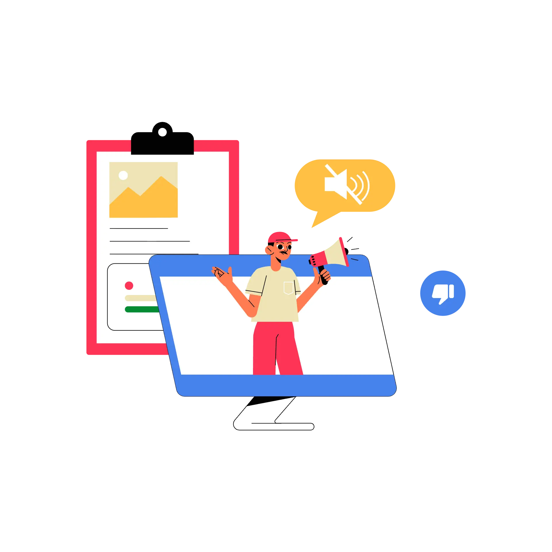
On-screen captions and callouts aren't a nice touch. They're load-bearing. If your message requires the voiceover to land, most of your viewers never received it.
Here's the hierarchy of how a muted viewer processes your video:
- Motion draws the eye first. Before they read anything, they're tracking movement.
- The caption anchors meaning. Once their eye lands, the text tells them what they're looking at.
- Audio reinforces — for the minority who unmuted. It adds polish and emotion for the small percentage who chose to turn it on.
The most common failure mode? Scripts written for voiceover, then captions added as an afterthought in post. The result: caption text that's too long to scan, paced for ears instead of eyes, or completely misaligned with the visual action on screen. You get a video that sounds great and communicates nothing.
Caption Design as a Conversion Variable
Captions are not subtitles. They're not a transcript. They're a conversion tool — and they have rules.
Caption length: No more than 6–7 words visible at any one time. Once you cross that threshold, the viewer has to choose between reading and watching. They can't do both. And when they can't do both, they do neither — they leave.
Caption timing: Text must appear at the exact moment the visual action it describes is happening. Not a beat before (confusing — nothing to anchor the words to). Not a beat after (redundant — they've already processed the visual and moved on). Simultaneous.
Caption design: High contrast. Clean font. Consistent placement. The goal is zero cognitive friction. The viewer's brain should never have to decide whether to watch the animation or read the caption. Make both effortless, and they'll do both.
When caption design is treated as a conversion variable from day one — briefed, spec'd, and reviewed with that lens — the performance difference is not marginal. It's measurable in PPO results.
The Poster Frame — The Most Under optimized Asset in Your App Store Listing
Here's a fact that changes how you think about the poster frame: autoplay can be turned off manually, pauses on low battery, and doesn't trigger on slow connections. In every one of those scenarios, the poster frame is the only video asset your user sees. It is, effectively, a screenshot.
Most teams pick it by scrubbing to a frame that "looks good." That's the wrong brief entirely.
The poster frame isn't a video thumbnail. It's a standalone conversion asset. It needs to function exactly like your best screenshot: clear value proposition, readable text, compelling visual — without any context. Because it gets zero context.
A poorly chosen poster frame has a second cost people overlook: it pushes your screenshot gallery to the right. That means your second screenshot — often your most information-dense — becomes partially invisible on the first impression view. One bad poster frame decision costs you the frame itself and the screenshot real estate adjacent to it.
How to Choose and Test Your Poster Frame
Don't pick a poster frame based on gut feel. Run a process.
Step 1: Shortlist five candidate frames from the final cut. These should be moments of visual clarity — not mid-transition, not motion blur, not a frame where the UI is mid-animation and looks broken.
Step 2: Apply the 3-second rule. Show each frame to someone with zero context and ask: "What does this app do?" If they can't answer in under three seconds, that frame is not your poster.
Step 3: Take the top two candidates into Apple's Product Page Optimization tool. PPO lets you test up to three treatments against the original, running for up to 90 days, with conversion data visible directly in App Store Connect. This is the closest thing app marketing has to a controlled experiment.
Test isolation is non-negotiable. When you're testing poster frames, freeze everything else — icon, screenshots, description. If you change multiple variables simultaneously, you can't attribute the conversion delta to anything. One variable. One test. One answer.
A/B Testing Your App Store Explainer Video — A Practical Framework
Most app teams upload a video and walk away. The top teams treat it the same way they treat a paid acquisition funnel: as an ongoing experiment with measurable variables and a clear testing sequence.

Here's the mechanical walkthrough for Apple's PPO: In App Store Connect, navigate to Product Page Optimization. Create a treatment. Upload your new App Preview as the variant. Isolate the change to one element — ideally the first five seconds of the hook. Set a 50/50 traffic split. Let it run for one to two weeks before drawing conclusions.
Now let's talk about what to test and in what order. These are the five highest-leverage variables, ranked by impact:
- Opening scene / hook — The highest ROI variable. A stronger hook lifts everything downstream.
- Feature order — Which feature gets screen time in seconds 5–15 changes who self-selects to install.
- Caption density — More words vs. fewer words vs. callout-style text. Each hits differently.
- Number of videos — One 30-second preview vs. two 15-second previews focusing on different features.
- Poster frame — Last to test, but meaningful — especially for users who don't trigger autoplay.
That fourth variable deserves a closer look. Two short app previews focused on two different features have consistently outperformed a single 30-second video in testing across multiple categories. It's a non-obvious finding. Most teams never test it because "one video" feels like the default. It shouldn't be.
What to Measure — and What Not To
The right metric is Product Page Conversion Rate (PPCR): installs divided by product page views. Not impressions. Not taps. Not total download volume, which is contaminated by paid channel spend and can mask a weak organic CVR entirely.
There's a trap worth naming: a video that dramatically increases installs but misrepresents the app experience will hurt you downstream. You'll see a lift in PPCR and a crash in Day-1 retention. The video over-promised. The app under-delivered. That's not optimization — that's a churn factory.
The goal is more qualified installs. Users who watched the video, understood what the app does, and installed because it matched their need. That's the conversion worth engineering for.
Test This → Don't Conclude From This Alone
- Product Page Conversion Rate (PPCR) → not total download count
- Install rate per page view → not impression volume
- Day-1 retention (for quality signal) → not tap-through rate in isolation
- Uninstall rate (downstream check) → not short-run results (under 1 week)
- PPCR by traffic source → not paid channel download spikes
Animation vs. Screen Recording — Which Drives More Installs?
Short answer: it depends on the platform. And getting this wrong can get your video rejected entirely.
Apple App Store: Apple's guidelines state that App Preview footage should be primarily screen-recorded. In practice, enforcement is inconsistent — some animated videos get approved, others get rejected. The safe path is screen recording as the base layer, with motion graphics, animated callouts, and text overlays on top. That hybrid approach satisfies the guideline and gives you full creative control.
Google Play: Full animation is not only allowed but often outperforms screen recording for complex apps. Why? Because animation shows outcomes, not interfaces. You can visualize what the app changes in someone's life, not just what it looks like to tap through it. That's a storytelling advantage screen recording can't match.
Here's a Google Play data point most teams sleep on: portrait video format yields +7% watch time, +9% video completions, and +5% conversion compared to landscape — according to Google's own data from PlayTime 2024. The majority of brands still default to landscape because "it looks more cinematic." Their viewers are watching on a phone, held vertically. The format mismatch costs real completions.
The Hybrid Approach — When Motion Graphics Inside App Footage Win
For Apple, the sweet spot is a compliant hybrid: real in-app screen recordings as the base layer, with motion graphics production, animated callouts, and kinetic captions layered on top.
This approach threads the needle. You satisfy Apple's in-app footage requirement. You keep the visual control needed to direct viewer attention, highlight micro-interactions, and maintain brand consistency. You get a video that looks and performs like animation while passing review.
Here's where teams get into trouble with this approach: Apple's compliance line is thin. There's a meaningful difference between "annotating real UI functionality" and "implying a feature that doesn't exist in the product." Cross that line — even unintentionally, through an overly polished motion callout — and you're looking at a rejection or, worse, a guideline violation that affects your listing.
That's the case for working with a production partner who has navigated that line before. It's not a creative judgment call. It's an institutional knowledge problem.
Yans Media in Practice — What Conversion-First Video Production Looks Like
Most video agencies deliver a video. Yans Media delivers a conversion asset.Hook structure, caption load, scene timing, and poster frame selection are written into the creative brief before a single frame is designed. Every production decision is a conversion decision from day one.That's the process behind results like these: Varpet saw a 35% conversion lift on the App Store after their video launch. Chatrandom — one of the leading free random chat apps — used Yans Media video production to support their growth to millions of users worldwide.If you want a video built around conversion mechanics, not just aesthetics, start here.
5 App Store Video Mistakes That Are Costing You Installs
You can fix all of these without reshooting. Most require a production decision, not a budget increase.
1. Opening with branding instead of the hook. The logo reveal is a gift to your competition. It costs you the 10% viewer drop-off in the first five seconds that you never get back. Lead with the tension, not the trademark.
2. Designing the video with sound. The majority of App Store previews are watched muted. If your message depends on voiceover to land, most viewers never received it. Every key message must exist visually — then audio reinforces it for those who opt in.
3. Skipping poster frame optimization. A poorly chosen poster frame pushes your screenshot gallery to the right, making your second screenshot invisible on first impression. You're not just losing the frame — you're losing the screenshot adjacent to it. Both suffer from one bad decision.
4. Never running a PPO test. Uploading a video and leaving it static treats a conversion lever like a set-and-forget asset. The best-performing apps treat their video the same way they treat paid acquisition: ongoing experiments, iterative improvements, measurable results. PPO exists. Use it.
5. Using the same video on Apple and Google Play. Only 6% of Google Play users actually play a video, while Apple auto-plays previews for nearly every listing view. These platforms have fundamentally different consumption behaviors, content rules, and format preferences. One video serving both platforms is a compromise that serves neither well.
FAQ — App Store Explainer Video Optimization
How long should my app store video be?
Apple App Preview: The platform limit is 15–30 seconds. Based on drop-off data, the sweet spot is 20–25 seconds — long enough to demonstrate 2–3 key features, short enough that 80%+ of viewers still reach the end. If you can't say it in 25 seconds, the problem is in the script, not the length limit.
Google Play promo video: 30–90 seconds is the productive range. The fuller storytelling format justifies the additional time — and on Google Play, you're not fighting the same brutal drop-off mechanics because playback isn't auto-triggered on every listing view.
Does an app store video directly affect my ASO ranking?
Not directly. Neither Apple nor Google has confirmed video as an explicit ranking signal in their algorithms.
However, here's the indirect mechanism that matters: a higher conversion rate — more installs per product page view — sends a positive behavioral signal to Apple's algorithm. Apps with strong conversion get favored in search and browse placement. Video that drives installs therefore drives ranking. It's one step removed, but the path is real and measurable.
How many app preview videos should I upload?
Apple allows up to 3 per localization. The data-backed starting point: two short previews focused on two different features consistently outperform a single 30-second video in head-to-head tests. Start there. Test it via PPO before committing to three. Let the data tell you whether a third video adds lift or just adds noise.
Should I use animation in my Apple App Preview?
Full animation will be rejected by Apple. The compliant approach — and the one that performs best — is real in-app screen footage as the base layer, with motion graphics overlaid: animated callouts, kinetic captions, transition effects. You get the visual impact of animation within Apple's compliance requirements. That's the approach Yans Media builds for Apple App Preview production.
What is Product Page Optimization and should I use it?
PPO is Apple's built-in A/B testing tool. It lets you test up to three treatments of your App Store product page — including app preview videos — against the original listing, with conversion results visible directly in App Store Connect. Tests can run for up to 90 days.
Should you use it? Yes. Every app team should be running at least one PPO test at all times. Your app store listing is a live conversion asset — leaving it untested is the same as running a paid campaign with a landing page you've never optimized. The tool is free. The upside is compounding. Run the test.
Final Takeaway
An app store explainer video isn't a creative decision — it's a conversion rate decision.
The teams consistently outperforming their category in installs understand drop-off curves. They design every frame for muted viewing. They treat the poster frame as a standalone asset. They run PPO tests the same way they run paid acquisition experiments. For them, "uploading a video" is the start of the process, not the end.
Every second of video you produce is either earning installs or losing them. The mechanics that determine which — the hook structure, the caption design, the poster frame strategy, the test sequence — are not mysteries. They're documented, measurable, and repeatable.
The only question is whether you build around them from day one, or reverse-engineer your mistakes after the fact.
