Apple's visual identity is instantly recognizable — and typography is doing half the heavy lifting. Most people hear "San Francisco" and stop there. That's a surface-level answer to a deeper system. Here's the full picture: what fonts Apple uses, why they work, and what brand and video teams can learn from them.
The Short Answer: Apple's Primary Font Is San Francisco
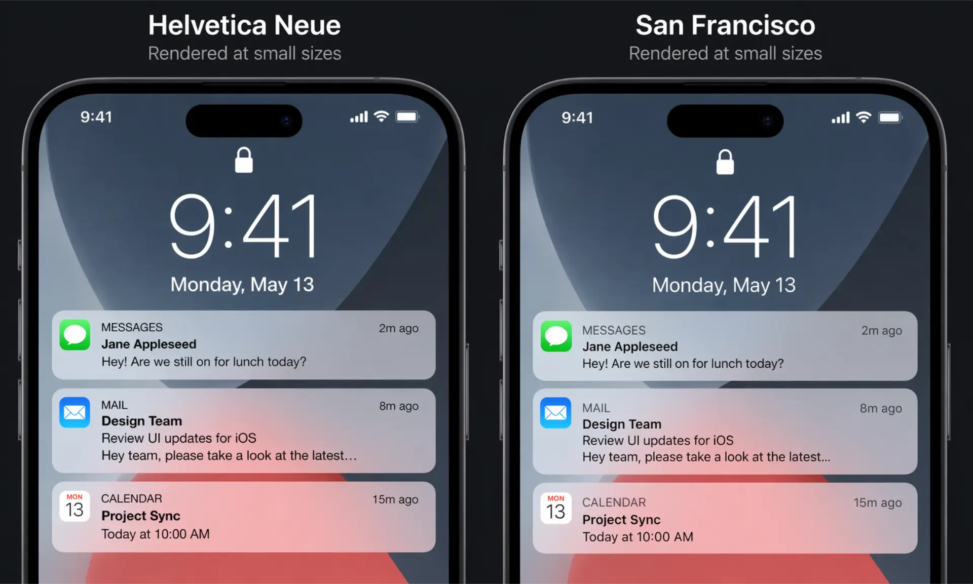
In 2015, Apple replaced Helvetica Neue with San Francisco (SF) — a custom-designed typeface built from scratch for digital screens. It now runs across every Apple platform: iOS, macOS, watchOS, and tvOS.
This wasn't a cosmetic upgrade. It was an engineering decision. Helvetica wasn't built for small screens. San Francisco was.
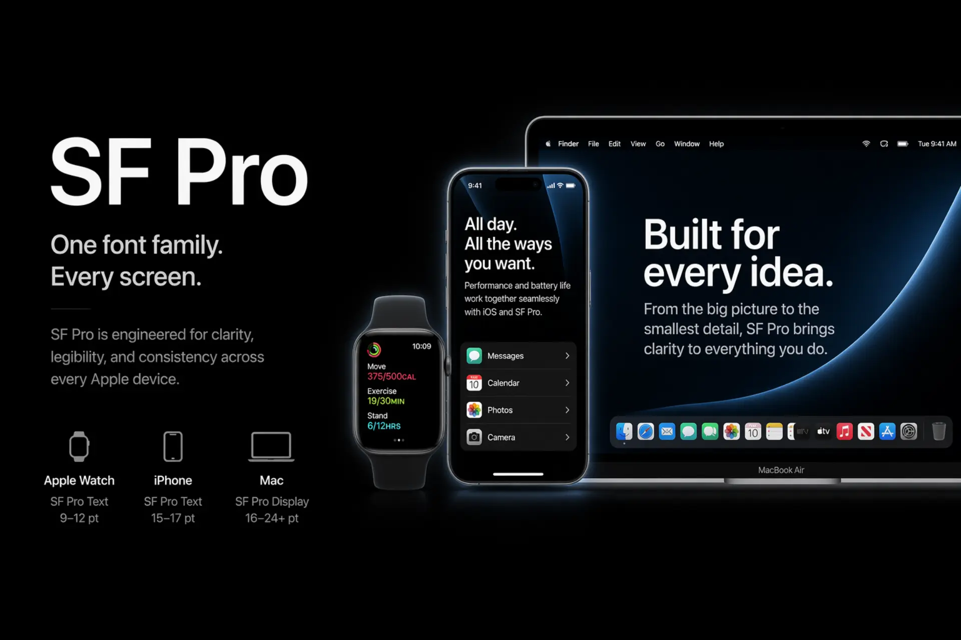
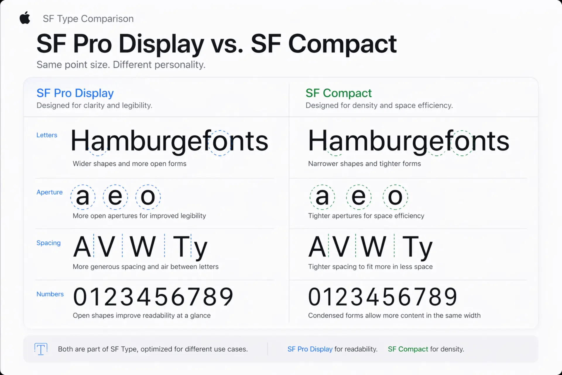
SF Pro vs. SF Compact — What's the Difference?
- SF Pro — Used on iPhone, iPad, and Mac. Wider spacing, optimized for larger displays.
- SF Compact — Used on Apple Watch. Tighter letterforms, built for dense, small-surface UI.
Both come in two optical sizes — Display and Text — that automatically adjust letterform details based on rendered size. That's not a design luxury. That's precision engineering.
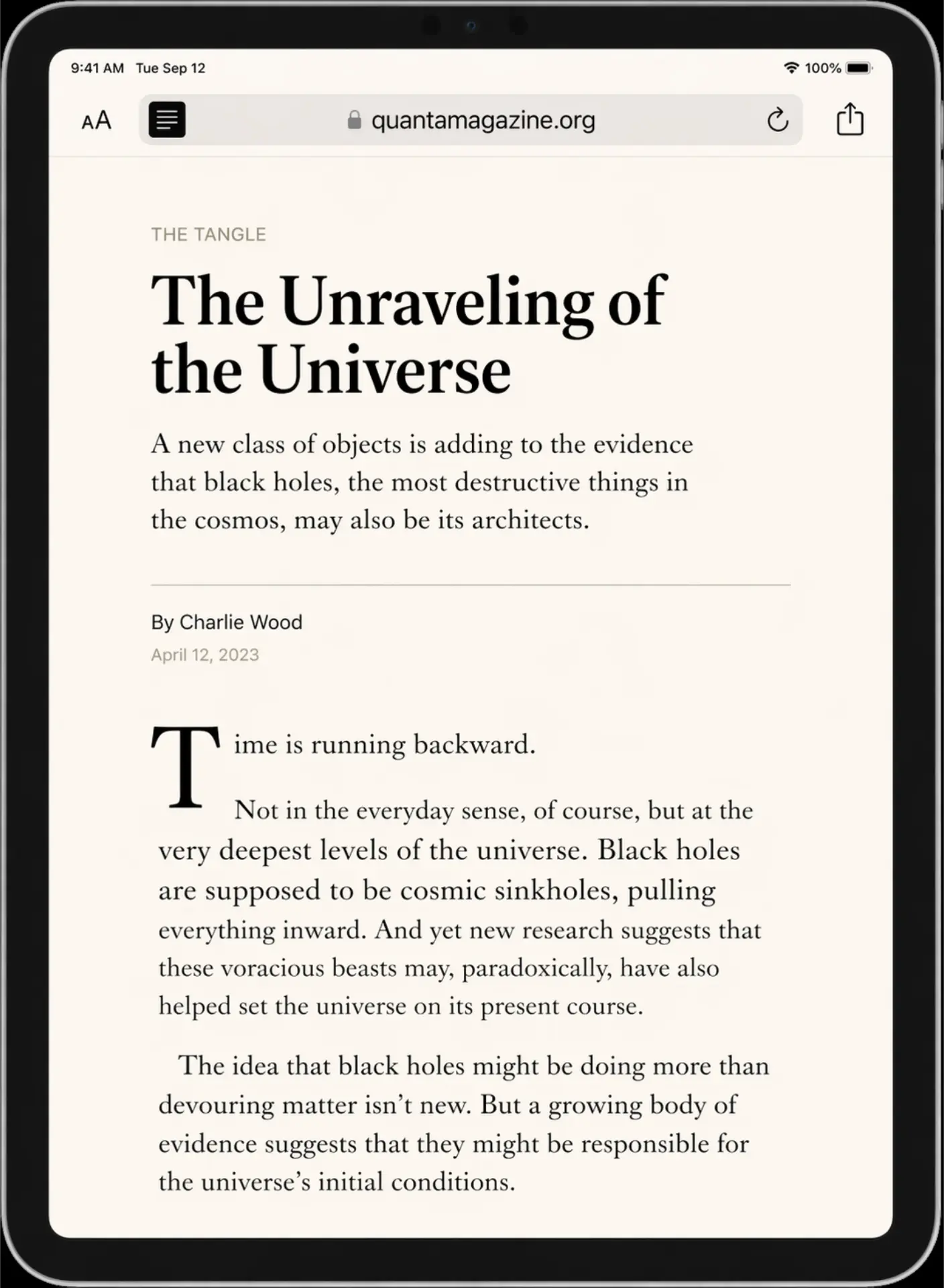
New York — Apple's Serif Companion
Launched in 2019, New York is Apple's custom serif typeface. You see it in Safari Reader mode, Apple Books, and select marketing materials. It's not a historical revival — it's a forward-looking serif redrawn specifically for screen rendering. Pairs with San Francisco the way a great headline font pairs with a clean body face.
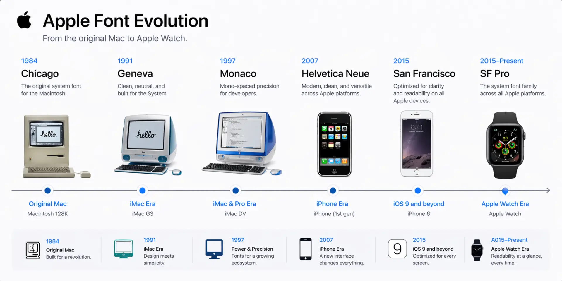
A Brief History of Apple's Typography Choices
Apple's font history mirrors its product evolution. Each shift wasn't aesthetic whim — it was a functional response to new hardware constraints.
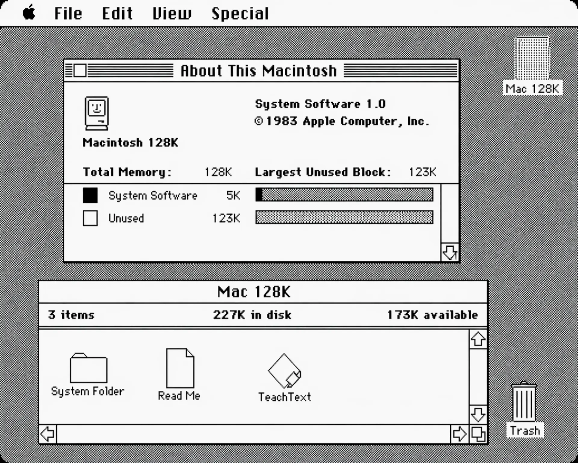
- Chicago / Geneva (1984) — Bitmap typefaces by Susan Kare, designed for 72dpi screens. Defined early Mac personality.
- Charcoal (1997) — Replaced Chicago in Mac OS 8. Cleaner, less chunky.
- Lucida Grande (1999–2013) — The workhorse of OS X. Solid screen font, never flashy.
- Helvetica Neue (2013–2015) — iOS 7 brought a flat design revolution. Helvetica rode in with it.
- San Francisco (2015–present) — Built for Apple Watch, scaled to everything else.
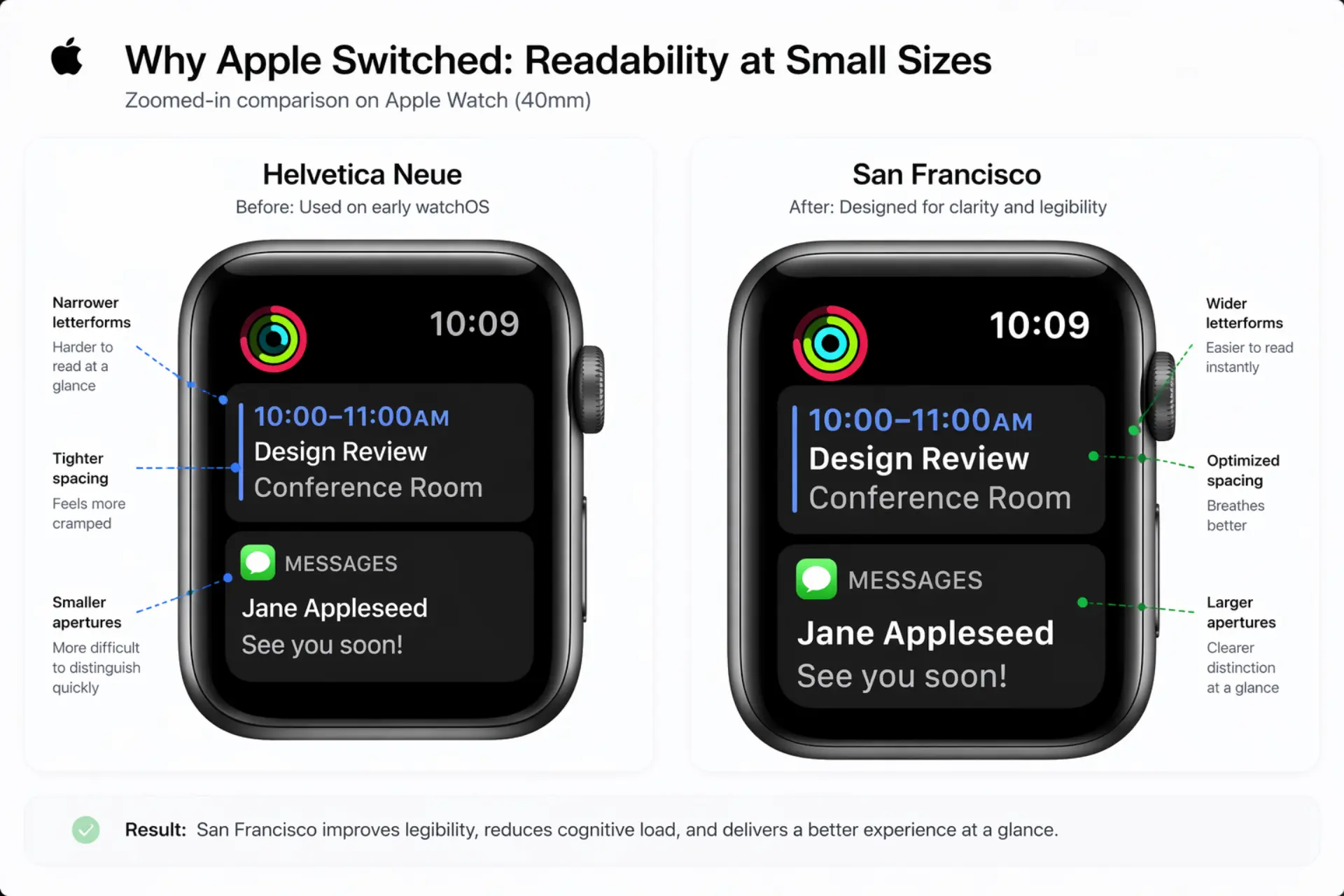
Why Apple Abandoned Helvetica Neue
Helvetica Neue is a masterpiece — for print. On a 38mm Apple Watch face at 6pt, it became unreadable noise. San Francisco was designed to solve that specific problem. Tighter apertures, more open counters, optimized spacing at small sizes. A functional constraint turned into a brand asset.
The Chicago and Geneva Years — Worth Knowing
Susan Kare's early Mac fonts weren't just functional — they gave personal computing a personality. This matters because it proves Apple has always treated typography as a core identity decision, not a default. That philosophy hasn't changed in 40 years.
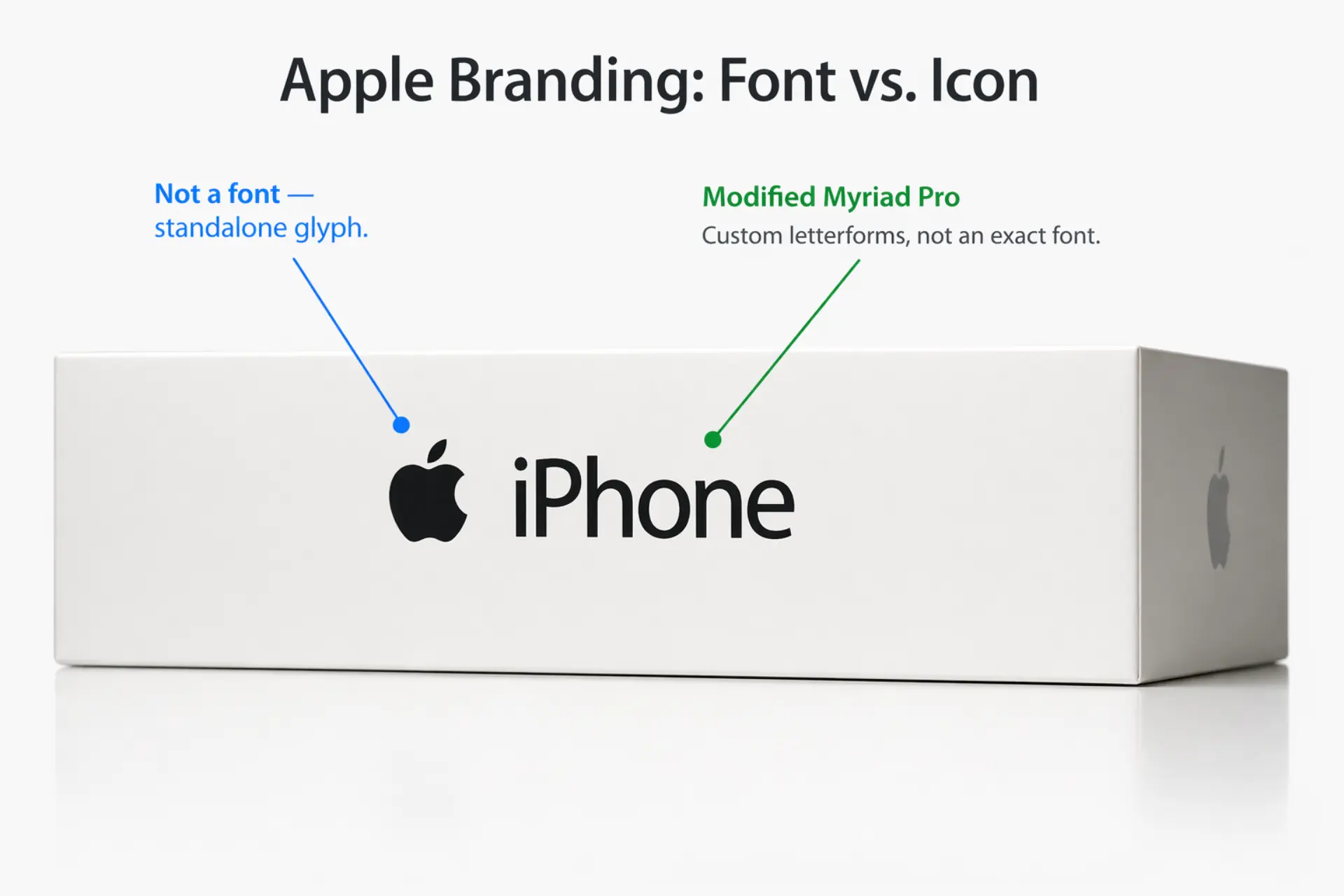
What Font Does Apple Use for Its Logo?
The Apple wordmark — "iPhone," "MacBook," product names on packaging — uses a customized version of Myriad Pro, a humanist sans-serif originally by Adobe. Apple licensed it and modified it heavily. The version they use isn't publicly available.
The apple symbol itself is a glyph, not a font character. Designed by Rob Janoff in 1977. The font has nothing to do with the icon.
How Apple Uses Typography in Its Videos and Marketing
This is where most competitors stop — and where things get genuinely interesting for video teams.
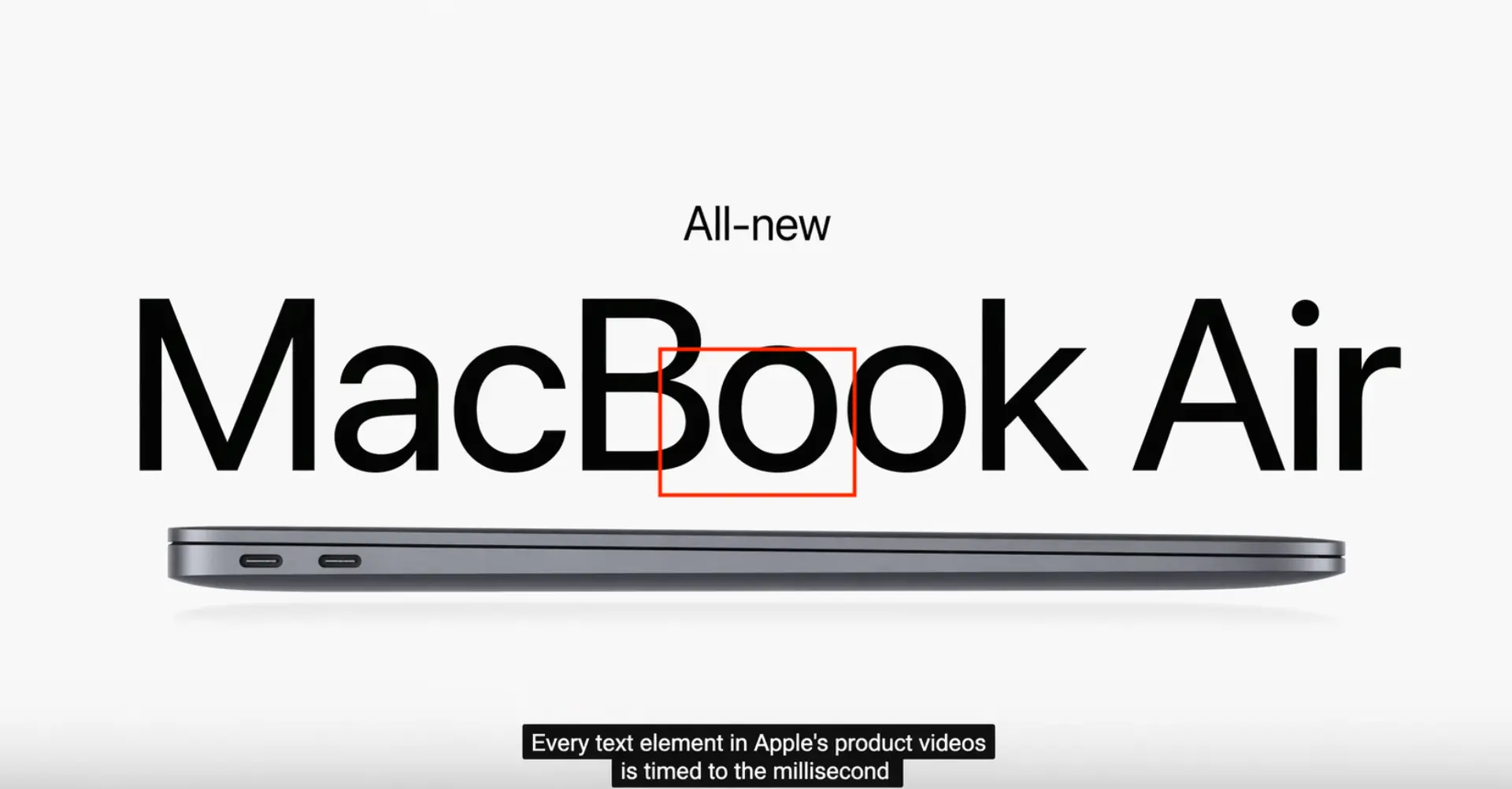
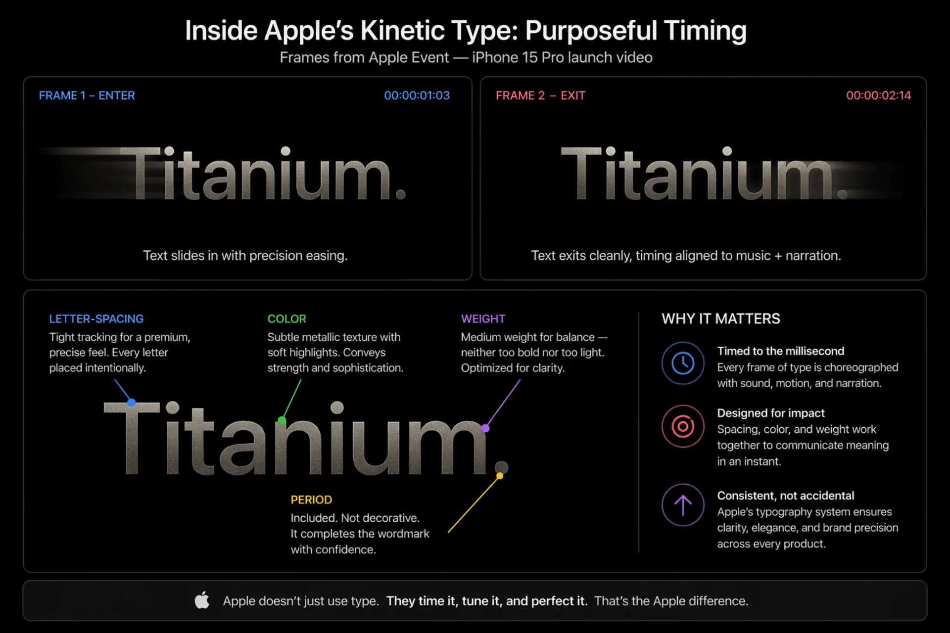
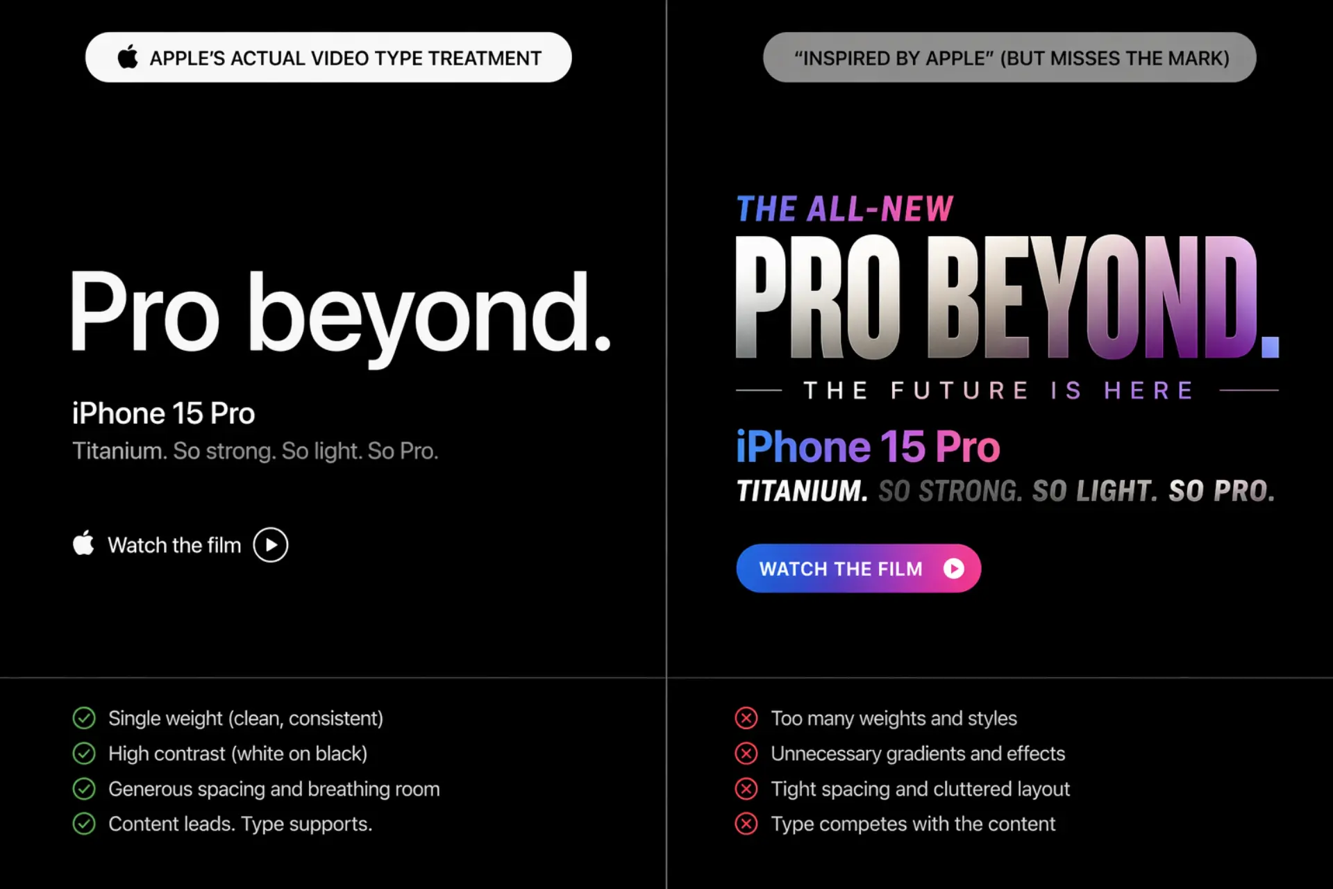
Apple's product launch videos and keynote presentations are masterclasses in typographic motion design. SF Pro appears as UI overlays, feature callouts, and spec text in product demos. But here's the thing: type in Apple videos is never decorative. Every text element is timed to voiceover and music with surgical precision.
What Apple Gets Right About Type in Motion
- Letter-spacing is wider in video — on-screen type needs breathing room that print doesn't. Apple knows this.
- Entrances and exits are purposeful — text doesn't just fade in. It appears at the exact moment the information is relevant, then exits cleanly.
- Color discipline — Apple pairs SF Pro almost exclusively with pure white or black in motion contexts. No gradient text. No drop shadows. None of the visual noise that kills clarity.
The result? Every frame feels like it was approved by the same person. Because typographically, it was.
What Video Teams and Brand Marketers Get Wrong When Trying to "Look Like Apple"
Three mistakes, almost every time:
- Using San Francisco in isolation — The font is one variable. Without tight margins, generous whitespace, and color restraint, it looks like a cheap imitation. The system creates the aesthetic, not the typeface alone.
- Wrong easing curves — Apple's motion design uses custom ease-in/ease-out timing that matches the feel of its hardware. Stock After Effects defaults feel wrong next to it. The physics matter.
- Too many weights — Apple's typographic hierarchy uses very few weights simultaneously. When brands pile on Bold, Medium, Regular, and Light in a single screen, the hierarchy collapses. Restraint is the discipline most teams skip.
At Yans Media, we've built motion graphics for enterprise clients like Cisco and Visa — brands where every font weight and kerning choice goes through brand review before a frame is approved. That level of typographic discipline in motion is rare. And it's exactly what separates video that looks branded from video that is branded.
Can You Use Apple's Font — San Francisco — In Your Own Projects?
Short answer: not legally for marketing or video.
San Francisco is available through Apple's developer program, but the license restricts it to building apps and software for Apple platforms. You cannot use SF Pro in:
- Marketing materials
- Brand videos or social content
- Non-Apple software products
Free alternatives that get close:
- Inter — Closest match. Designed for screen legibility with similar aperture philosophy.
- Plus Jakarta Sans — Slightly more personality, equally clean.
- DM Sans — Geometric, friendly, great at small sizes.
All three are free on Google Fonts. All three will get you closer to the Apple aesthetic than grabbing SF Pro and hoping no one notices.
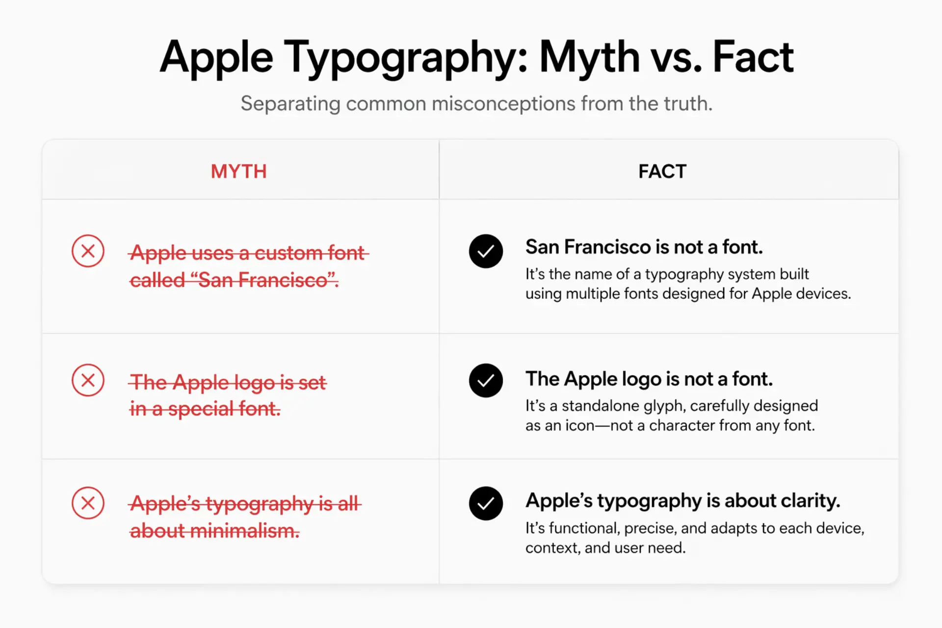
Common Myths About Apple's Typography
Myth: "Apple uses Helvetica."It did — until 2015. San Francisco replaced it entirely. Helvetica may linger in isolated legacy contexts, but it's no longer Apple's system typeface.
Myth: "Apple's font is free to download."Partially true. You can download it through Apple's developer program. But the license bars commercial, marketing, and non-Apple-platform use. "Free to download" ≠ "free to use."
Myth: "Any clean sans-serif will achieve the Apple look."The font is one ingredient. Whitespace density, type scale hierarchy, motion timing, and color restraint are equally responsible for the aesthetic. Use Inter without the system, and you'll look like you tried — not like Apple.
FAQ — What Font Does Apple Use?
What font does Apple use in its ads and commercials?
SF Pro handles UI moments and feature text. Product names use a modified version of Myriad Pro. Voiceover timing often dictates exactly when text appears on screen — it's choreographed, not templated.
What is the Apple logo font?
Modified Myriad Pro for product wordmarks like "iPhone" and "MacBook." The apple symbol itself is a standalone glyph — not a font character.
Did Apple ever use Times New Roman?
No. Apple's early fonts were custom bitmap designs by Susan Kare. Times New Roman has never been a system typeface in Apple's history.
What font is closest to San Francisco?
Inter. Same design intent: screen legibility, clean apertures, neutral but not cold. Free, widely supported, and won't get you a cease-and-desist.
Does Apple use the same font across all its products?
Yes. SF Pro (iPhone, iPad, Mac), SF Compact (Apple Watch), and New York (editorial and reading contexts) form one unified typographic system across every Apple OS and device.
The Bottom Line
Apple's typography isn't a style — it's an engineered system that moves from print to screen to motion without losing coherence. San Francisco and New York exist to do one thing: communicate with clarity at every scale, in every context, at any speed.
The brands that understand this treat typography as infrastructure, not decoration. It shows in their products. It especially shows in their videos.
If you're building video content for your brand and need the same typographic discipline — the kind that holds up through a 60-second product demo and a 6-second bumper ad — explore Yans Media's motion graphics and brand video services.
Every frame either reinforces your brand or quietly undermines it. Typography is where that battle is won.
